Most of these snippets belong to [Code] section as they are Pascal based.
|
Useful Functions, Procedures and
Variables
|
Graphical Installer contains many useful Functions, Procedures and Variables which may be handy when you want to change certain feature of installer or add a new one.
![]() Tip:
Tip:
Most of these snippets belong to [Code] section as they are
Pascal based.
These variables holds information about graphic elements used globally in whole project:
Font used for Buttons.
Current Windows DPI;
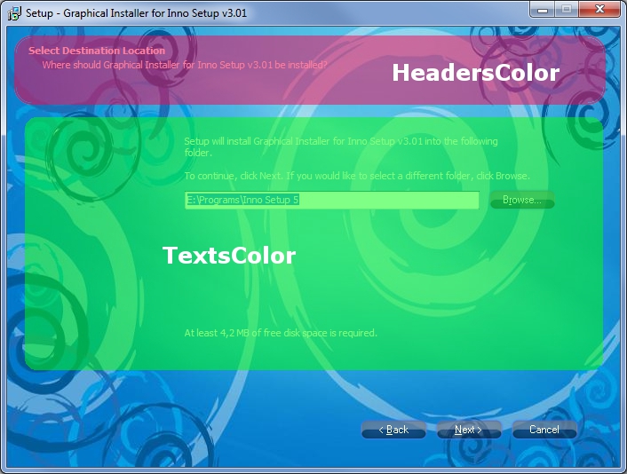
Specification of all text colors in installer (Texts shown in all pages of installer and in main window):
Color of all labels in installer. Labels are all static texts in installer window except the headers
Color of all header texts in installer. Headers are usually at the top of each page in installer..
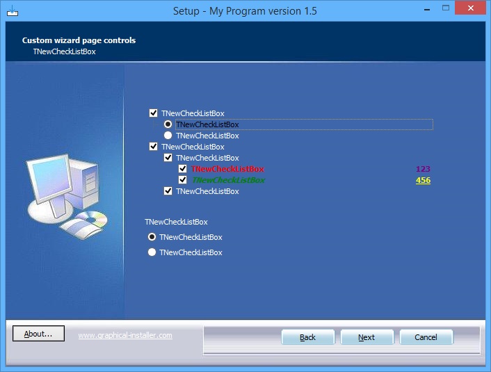
This color is used for TNewCheckListBox component - when some item is selected.

Specification of buttons texts colors in different situations:
Color of all button texts in installer. This color is applied to all buttons when button is in regular state.
Color of all button texts in installer. This color is when button is focused.
Color of all button texts in installer. This color is applied when button is pressed down.
Color of all button texts in installer. This color is applied when button is disabled.
Procedure for changing colors of progress bar (TNewProgressBar component) in Installation page (or any other page):
Parameters:
Handle: HWND - TNewProgressBar Handle.
Foreground: String - Foreground color of progress bar
(Format: $RRGGBB).
Background: String - Background color of progress bar
(Format: $RRGGBB).
Note: This procedure uses String parameter for colors ($RRGGBB
format), not TColor!

![]() Tip:
Tip:
To colorize the progress bar on Installing page (wpInstalling) use
the WizardForm.ProgressGauge.Handle as HWND
parameter.
Function creates clickable skinned button on desired position (most often in certains page):
Parameters:
Handle: HWND - Page (or Form) Handle when button should be
placed.
Left: Integer - Button Left position (in pixels, relative to
parent!).
Top: Integer - Button Top position (in pixels, relative to
parent!).
Caption: String - Button text.
ClickEvent: TNotifyEvent - event executed when the button is
clicked.
Return value:
HWND: Handle to created button (0 on error).
![]() Warning:
Warning:
To place button on certain page use correct Handle (HWND). Wizard
form is a little complicated as they are several components placed
over themselves.
The most common is using the WizardForm.InnerPage.Handle as
parameter.
This procedure shows or hides the skinned button:
Parameters:
Handle: HWND - Button Handle.
Value: Boolean - Button visibility (True = Visible, False =
Hidden).
![]() Tip:
Tip:
Call this procedure from procedure CurPageChanged(CurPageID:
Integer); to show or hide button in desired page.
This procedure enables to drag the installer window with mouse in the bottom area of WizardForm:
No parameters.
![]() Tip:
Tip:
Perfect place to call this procedure is:
procedure InitializeWizard();
begin
#ifdef GRAPHICAL_INSTALLER_PROJECT
InitGraphicalInstaller();
WizardForm.EnableDragging();
#endif
end;

Graphical Installer enhances the default Inno Setup component which brings new features and possibilities. New properties:
![]() Tip:
Tip:
TColor parameter accepts 4-byte hexadecimal number or the
constants. For example:
CheckListBox.ItemFontColor[5]:= $0000ff00;
CheckListBox.SubItemFontColor[5] := clPurple;

Sets the position of Back, Next, Cancel buttons relative to its current position. Useful when you need to change the positions of all three buttons and keep the distances among them.
![]() Tip:
Tip:
You can use negative values for inLeft and inTop
parameters.
Sets the absolute position of Back, Next, Cancel buttons with Left and Top coordinates. Useful when you need to change the positions of all three buttons and keep the distances among them.
![]() Tip:
Tip:
WizardForm contains OuterNotebook which is a component holding
Inner Dialogs of the setup form. If the background image height is
less than OuterNotebook.Height (usually 413 pixels), the Back,
Next, Cancel buttons will be placed there having
WizardForm.InnerPage.Handle.